CyclingStats Part 2
Oct 26, 2020
Check Out Some Recent Posts:
- React Leaflet Custom Map Icons
Nov 19, 2019
- Use 'const', Even When You Think You Shouldn't
Jan 23, 2019
- An Easy Way To Practice With Twig Without Drupal
Mar 28, 2018
- Hiding Progress Bar Steps in Drupal 8 Webform
Mar 26, 2018
After planning the content types, my next step is to start working on mockups for the design. The first two parts I built out were the main nav and the rider interfaces. I had some inspiration on the rider display screens from the start of everything so that came somewhat easily. The nav took a bit of thinking and looking at different possibilities, but I'm pretty happy with the results so far.
The colors are not final, but so far I'm feeling them so we'll see if they continue or get changed.
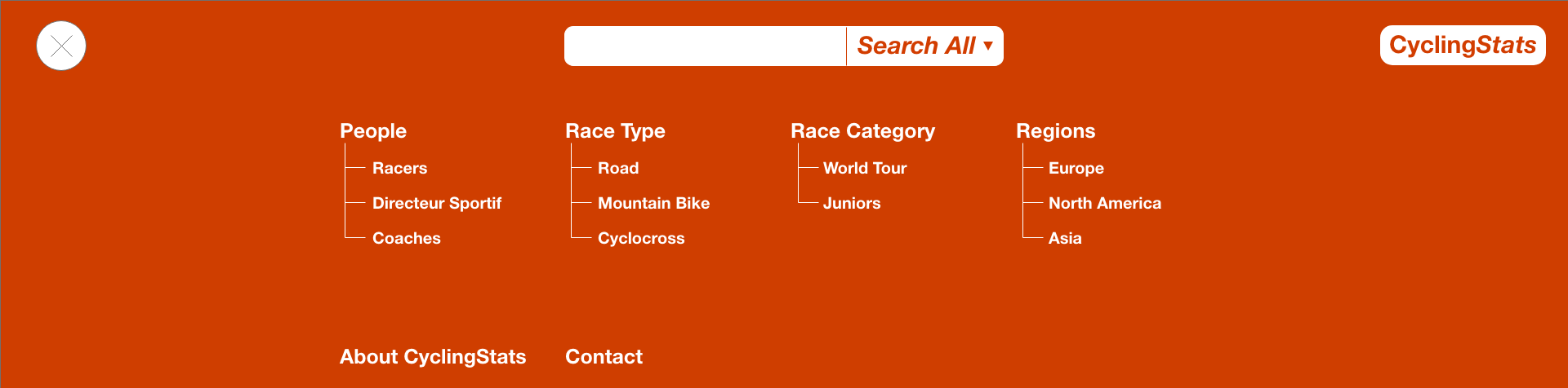
Nav
The base nav is pretty simple and clean. The goal was to make the search immediately available since it's one of the more important parts of the nav. The default for this would be that you can search all content but it would expand to let the user choose between different topics like races, people, regions, etc. On the far left is the menu button that will expand the full nav menu and allow access to much more of the site's contents. My assumption is that most people will be coming to the site to find something specific so having the search front-and-center is going to help the user find what they are looking for immediately.

The expanded nav is set up to give quick access to the landing pages for the different types of information that can be found. Mostly these will be links to taxonomy listings that will give a list of available data tagged with that taxonomy.
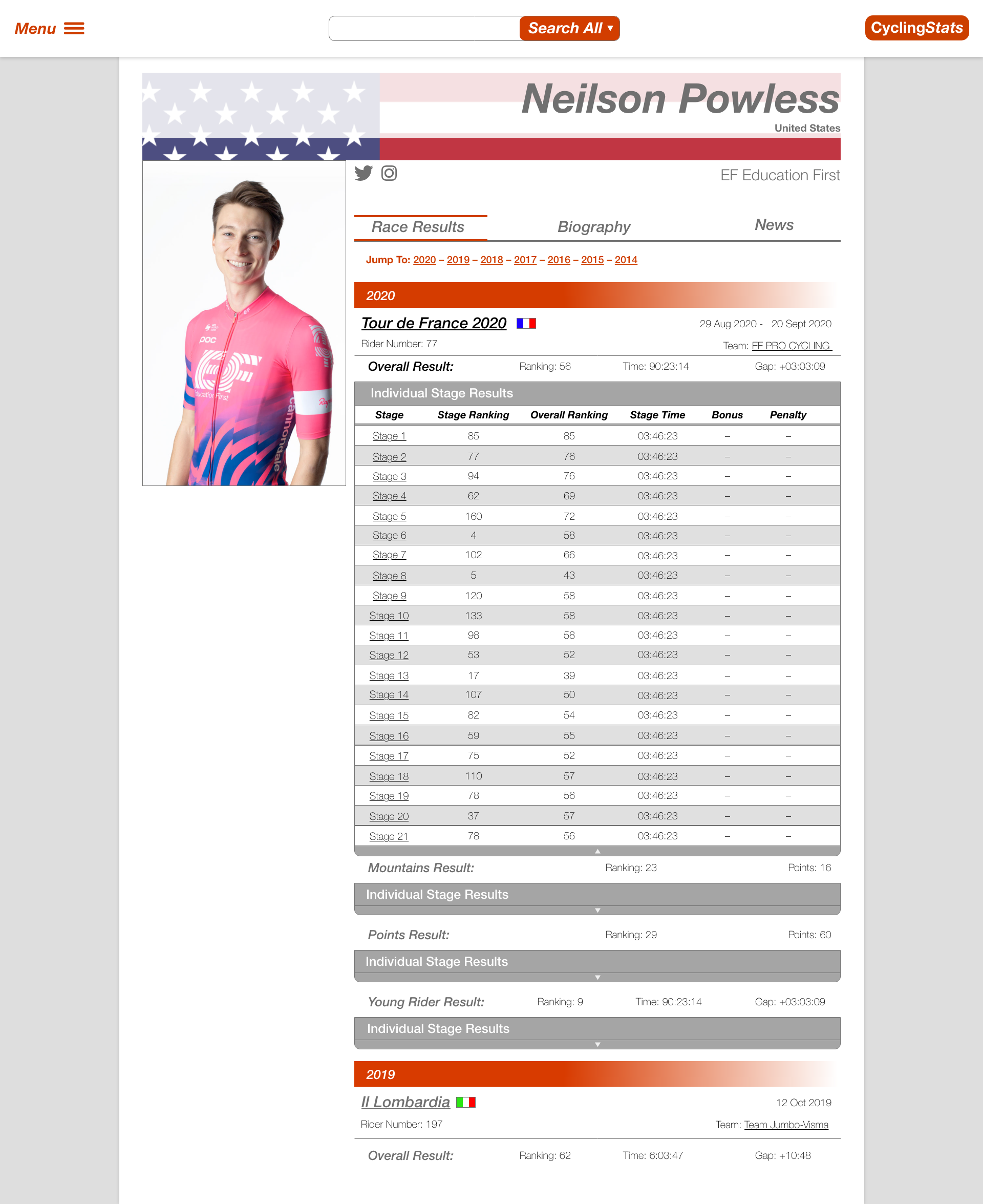
Individual Riders
While the content type of a person is generic to handle all different types of people, the display will probably be specific to different roles. The most obvious role is a rider. This is for an individual competitor in a race. The individual can be a part of a team that will be linked as well. They will also have some base information that's available at the top, like their home country and other information. Then I have three tabs that will display different information for the individual. These might change and/or they might change order, but the plan at the moment is for a list of the races they've participated in, their biography, and articles from around the web.
The first display I came up with is the race results view. This has a list of years at the top that the individual has races entered for. This list will be links to further down the page to allow quick access to any part of the results. Each race will have a header linking back to the main page for that race as well as relevant information about the rider for that race. This includes their bib number, team, the date(s) of the race, etc. If the race is a multi-stage race, like the Tour de France, The display at the top will be for the overall results and then there will be expandable listings for their individual stage results below.
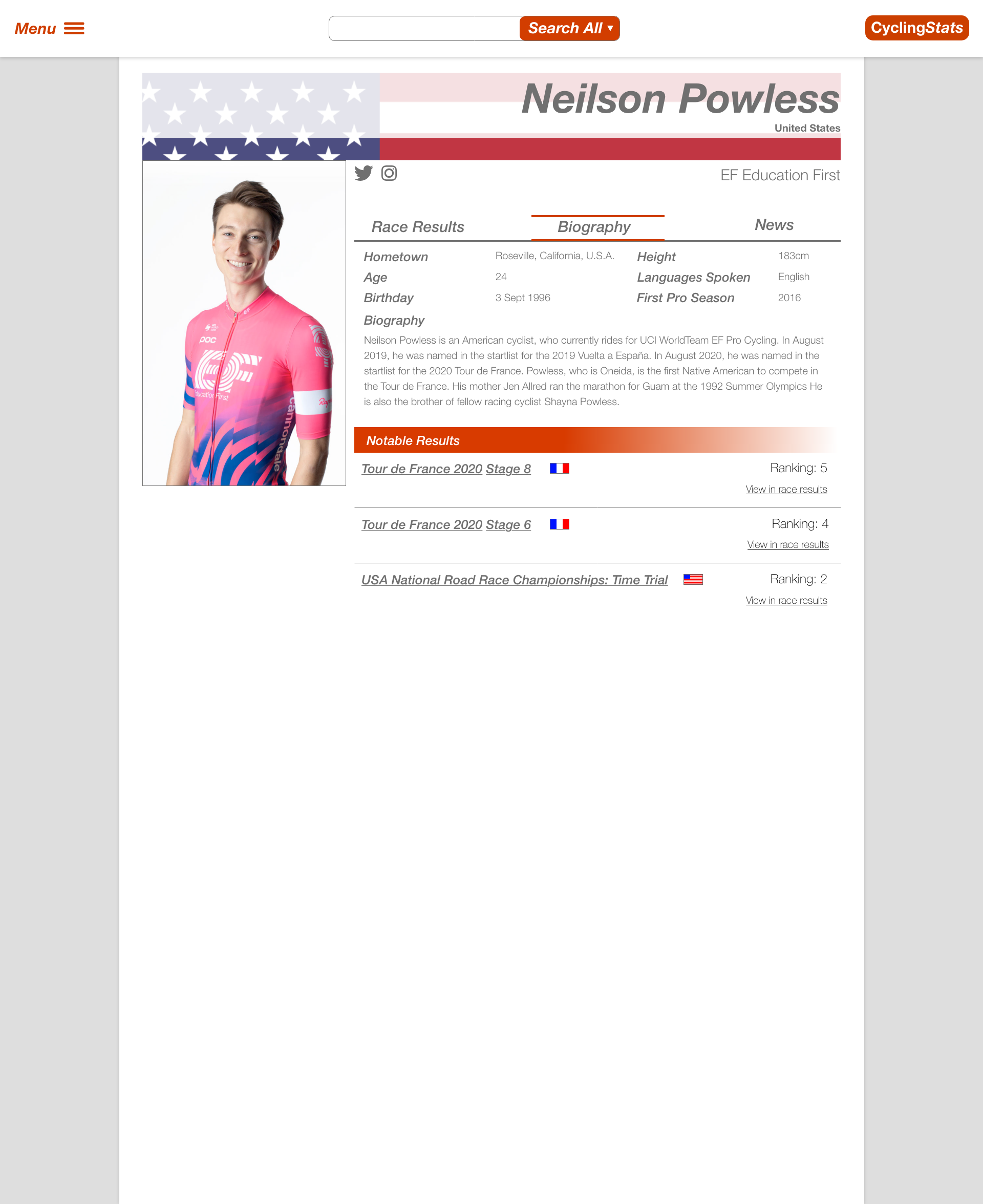
The next item is the rider's biography. This shows any relevant information about the individual that is available. I did a quick look at some other sites to get some ideas but this will probably expand and update over time.
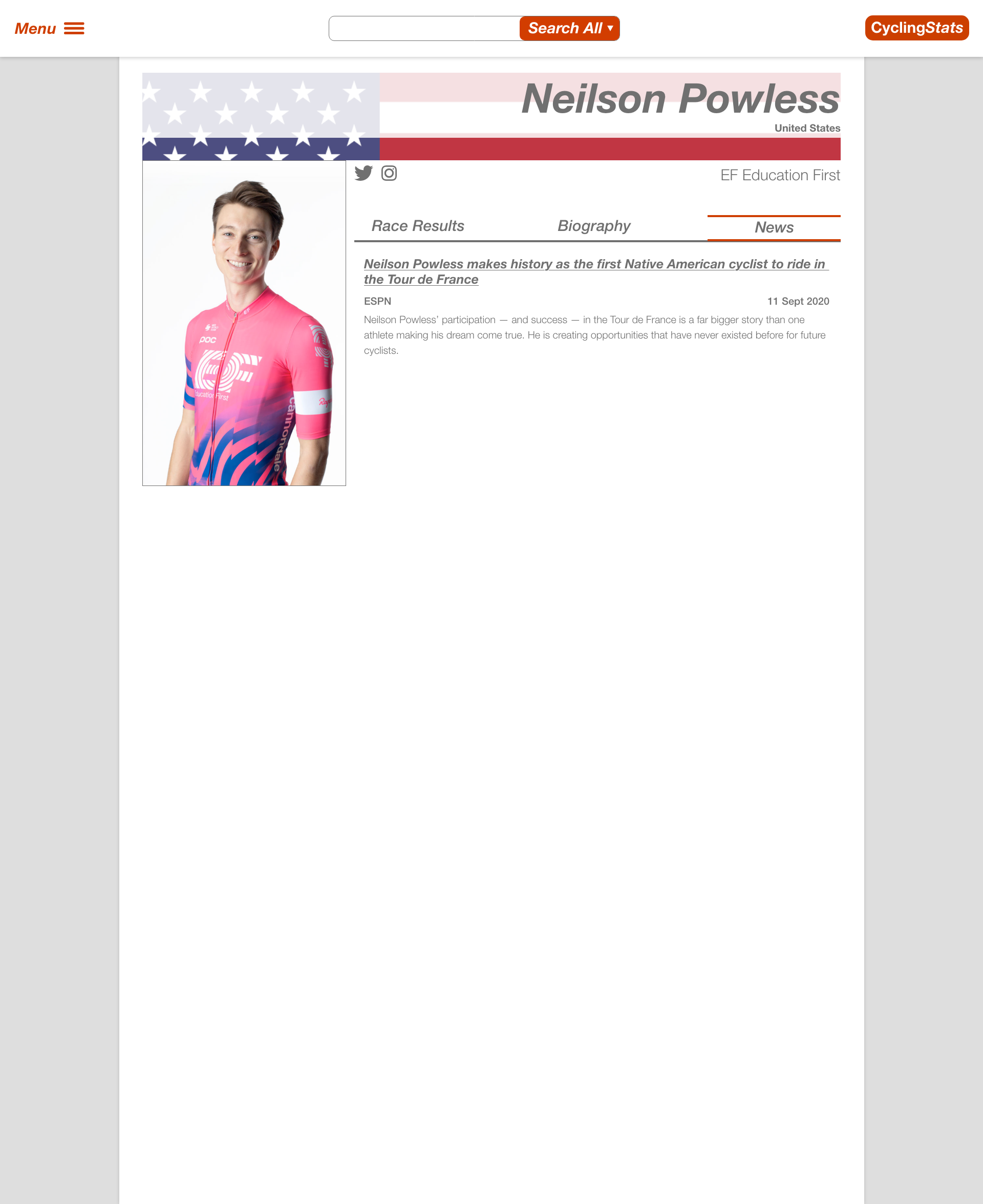
The third screen is to display a list of news articles for each user. This is probably something that will be created through an automated job or something to fetch articles periodically or something. I'm not sure the way these will be entered initially, but it's a pretty straightforward display with the title, publication, and a short preview of the article text.
So those are my mockups so far. I'm feeling pretty good about how they look but I know that they'll adjust and update over time. The next step will be to start planning out the race pages. If you have any suggestions or ideas for how these can be improved, feel free to reach out to me through any of my social media or other contact methods that you can find at the bottom of this page!
If you want to follow along with my progress, you can see the full list of tagged posts.
Back to the blogCheck Out Some Recent Posts:
- React Leaflet Custom Map Icons
Nov 19, 2019
- Use 'const', Even When You Think You Shouldn't
Jan 23, 2019
- An Easy Way To Practice With Twig Without Drupal
Mar 28, 2018
- Hiding Progress Bar Steps in Drupal 8 Webform
Mar 26, 2018